Table of Content
Google’s Iconic “G” Logo Gets a Vibrant Makeover with a Fresh Color Palette
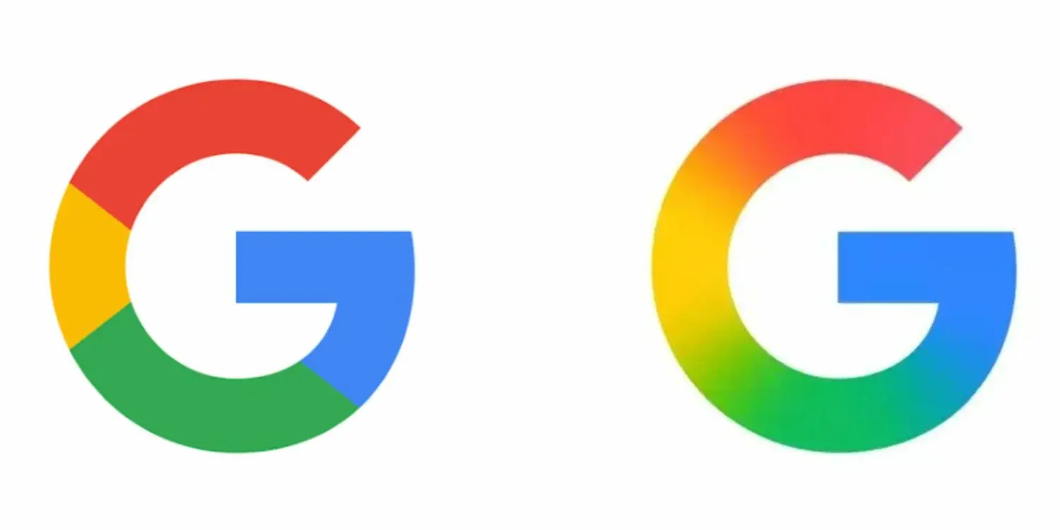
After a decade, Google is revamping its recognizable “G” logo, introducing a sleek new design that echoes the branding of another popular Google service. Although there was no formal announcement, iOS users can already catch a glimpse of the revamped icon, sparking curiosity among tech enthusiasts and fans alike.
- Overview of the new Google “G” logo design
- Inspiration behind the logo’s fresh color scheme
- Comparison with other Google product logos
- Impact on users and the tech community
- Details on the design update and its significance
The New Design: A Closer Look
The updated “G” logo boasts a bold and vibrant color scheme, marking a significant departure from its predecessor. The new design is not only visually striking but also reminiscent of the Google Drive logo, suggesting a unified branding strategy across Google’s suite of products.
As reported by 9to5Google, the change is subtle yet significant, reflecting Google’s effort to modernize its visual identity. The update is currently available for iOS users, who can view the new logo in the Google app.

Inspiration and Design Philosophy
The new color palette is not just a cosmetic change; it reflects Google’s commitment to innovation and user experience. By aligning the “G” logo with other Google services, the company is fostering a more cohesive brand ecosystem.
This design update is part of Google’s broader strategy to refresh its visual identity while maintaining its iconic status. The result is a logo that feels both modern and familiar, striking a balance between evolution and brand recognition.
User Impact and Reception
For users, the new logo represents a fresh perspective on a familiar brand. The change is likely to be welcomed by those who appreciate Google’s commitment to innovation and design excellence.
As the update rolls out across different platforms, users can expect a more unified Google experience, with the new “G” logo serving as a symbol of the company’s forward-thinking approach.
Design Update Significance
The significance of this design update extends beyond aesthetics; it underscores Google’s dedication to continuous improvement and user-centric design. By refreshing its logo, Google is signaling its commitment to staying relevant in a rapidly changing tech landscape.
This move is also likely to influence the broader tech industry, as other companies take note of Google’s approach to branding and design.
Conclusion
In conclusion, Google’s new “G” logo is more than just a visual update; it’s a reflection of the company’s values and its commitment to innovation. As the tech world continues to evolve, Google’s refreshed branding is poised to make a lasting impact.
Frequently Asked Questions
Q: What inspired the new Google “G” logo design?
A: The new design draws inspiration from other Google product logos, such as Google Drive, aiming to create a more unified brand identity.
Q: Is the new logo available on all platforms?
A: The update is currently available for iOS users through the Google app, with a wider rollout expected across different platforms.
Q: What does the logo update signify for Google?
A: The update signifies Google’s commitment to innovation, design excellence, and a more cohesive brand ecosystem.


